Design
02.01.25
/
7 min.
by
Laynie Pritchard
Share Article
Creating a successful e-commerce website involves more than just listing products and services. It's about crafting an experience that entices, engages, and converts visitors. Despite the best intentions, even seasoned designers can overlook critical elements that make a big difference. Here are the top 5 design oversights e-commerce brands make in the food & beverage sector, complete with examples of how to do it right.
1. Ignoring Mobile Optimization
The Oversight: Many e-commerce sites are still designed with a desktop-first approach, which can lead to poor mobile user experiences, such as slow loading times, difficult navigation, and checkout processes that aren't optimized for mobile devices.
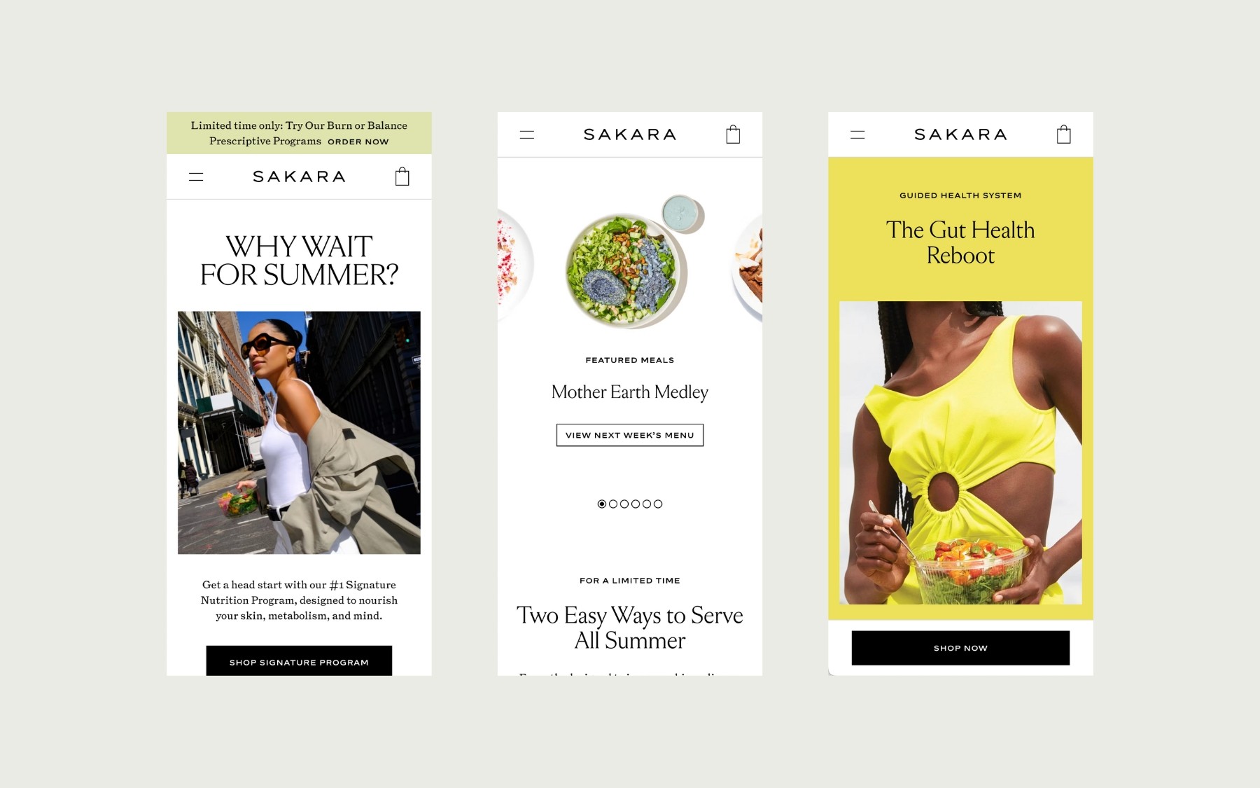
Example Solution: Sakara Life offers a stellar example of mobile optimization done right. Their mobile site is clean, visually appealing, and easy to navigate, ensuring that customers can effortlessly order their meal programs and wellness products from any device.
2. Underestimating the Power of Product Descriptions
The Oversight: Often, product descriptions in the food & beverage sectors are either too sparse or overly technical, missing an opportunity to connect with the customer and to boost SEO.
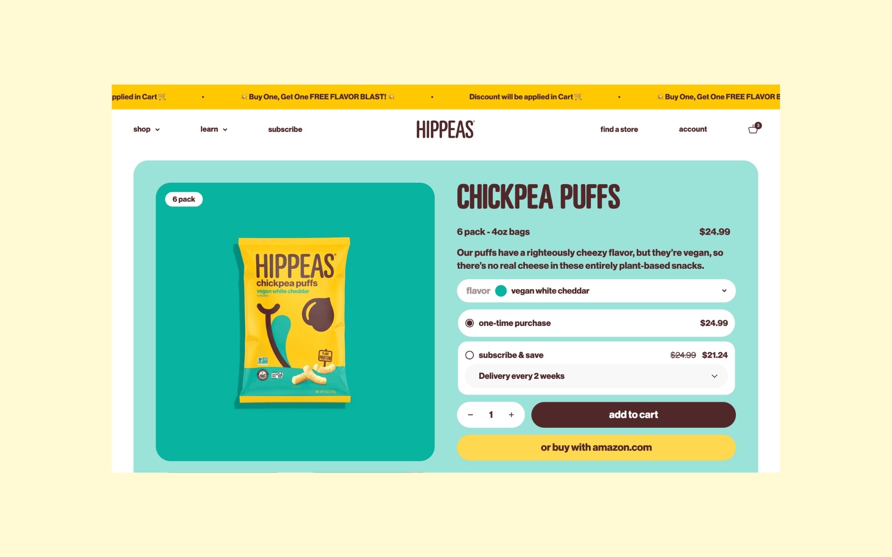
Example Solution: Hippeas leverages short, concise but vibrant product descriptions that capture the essence of their fun and flavorful chickpea puffs. Each product page is packed with appealing visuals and descriptions that highlight the vegan, gluten-free, and non-GMO attributes, catering to health-conscious snackers and environmental advocates alike.
3. Not Utilizing Quality Images
The Oversight: Some brands use low-resolution or inconsistent product images, which can hurt the perceived quality of the products and reduce trust.
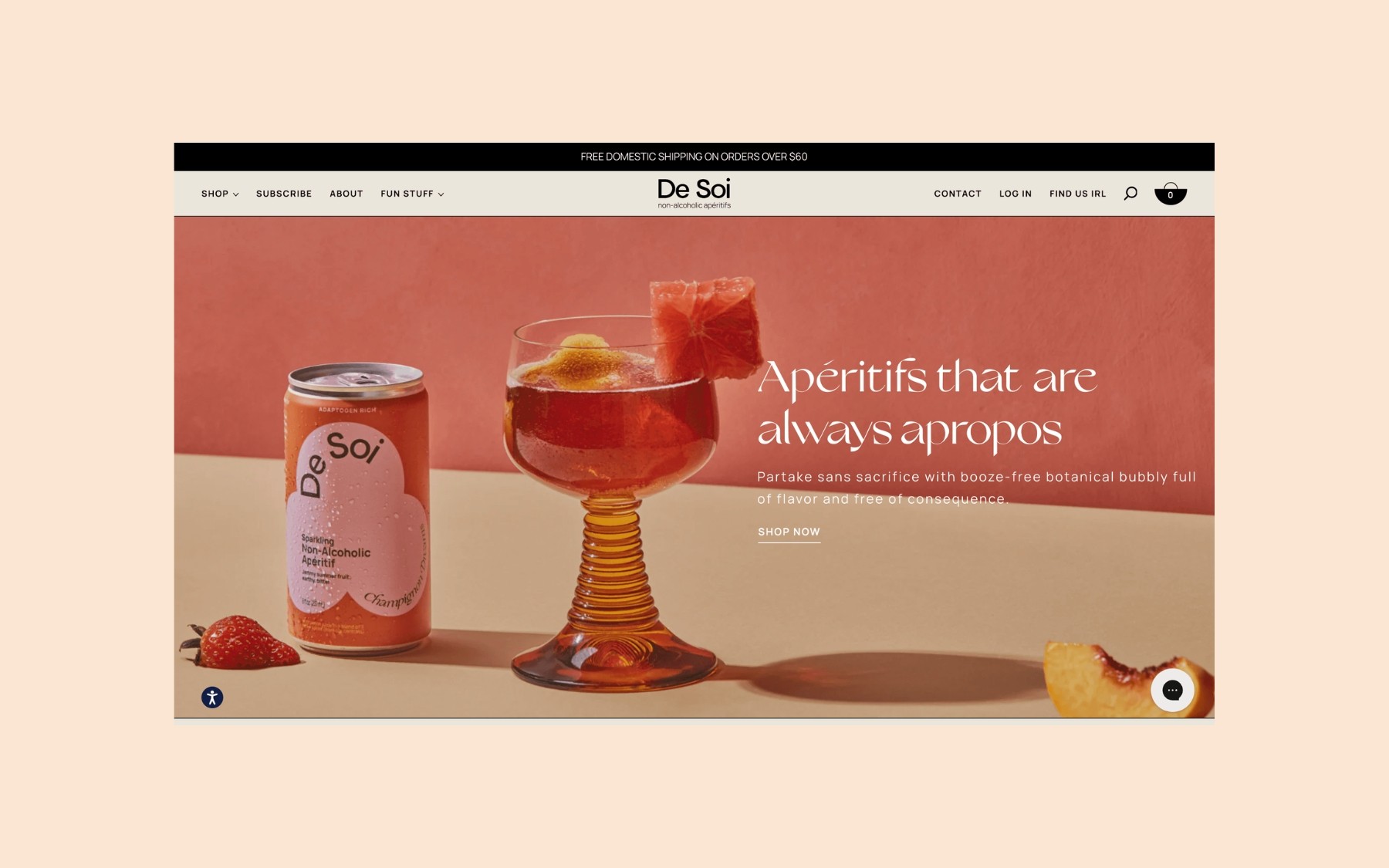
Example Solution: De Soi, a brand that offers non-alcoholic aperitifs, uses high-quality images that capture the elegance and sophistication of their products. The images are styled in a way that evokes a sense of celebration and relaxation, appealing directly to their target audience looking for upscale, healthy beverage options.
4. Overlooking Simple Navigation
The Oversight: Complex or unintuitive navigation can frustrate users, especially in sites with a diverse range of products.
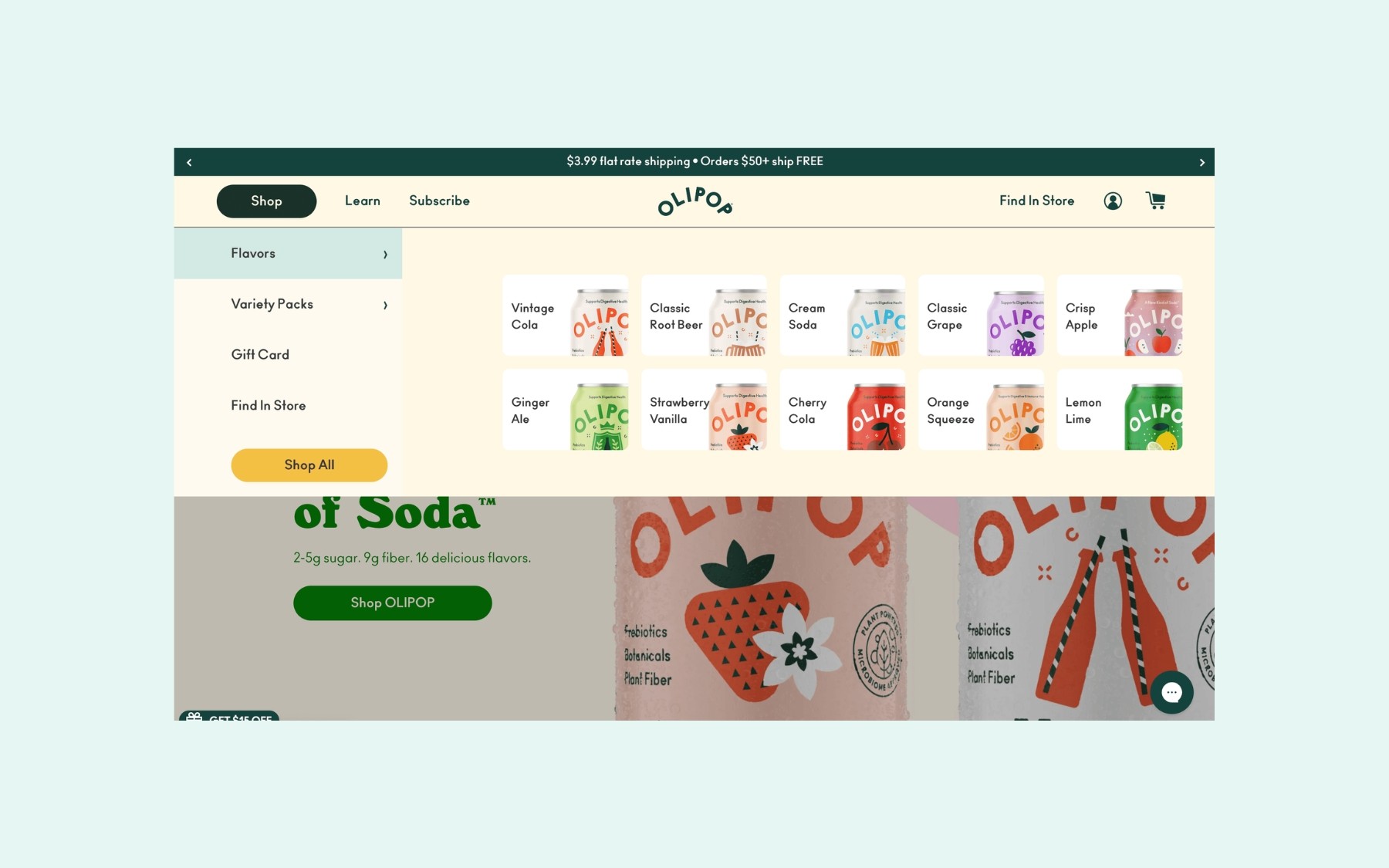
Example Solution: Olipop utilizes a clean and inviting website layout with simple, clear navigation that highlights all of their healthy soda flavors.
5. Adding Value Propositions
The Oversight: Not proactively addressing potential customer concerns before they reach the checkout can lead to abandoned carts and lost sales.
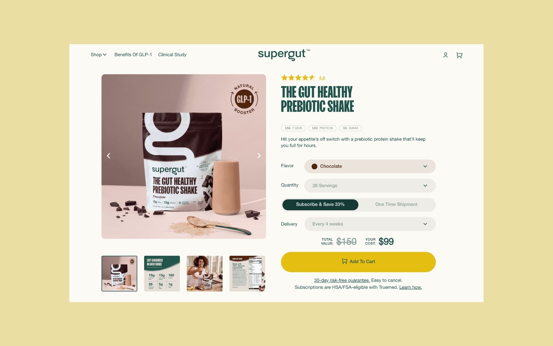
Example Solution: SuperGut excels by strategically placing value propositions across their product pages. They highlight key benefits of their product, the special price you get if you subscribe, customer reviews, and special incentives like 30-day risk-free guarantee. These cues effectively address potential customer hesitations and encourage purchases by reinforcing the value and urgency of the offer.
Conclusion
Avoiding these common design oversights can vastly improve the effectiveness of your e-commerce site in the food & beverage sector. Remember, every element on your site should purposefully enhance the user experience, from the moment they land on your homepage to the completion of a purchase.
Looking to upgrade your e-commerce site? At Mint Lane, we specialize in creating seamless online shopping experiences that capture attention and convert visitors into loyal customers. Contact us today to see how we can transform your e-commerce platform into a powerful selling tool.

Other Articles
